Tuesday, 31 August 2010

Pink Faces

I recently made a bunch of portraits of the key employees of Pola Design for their newly launched website. As you can see the dominant colour is magenta – my favourite.

Friday, 13 August 2010

Bon Appétit

A poster for a film script contest organized by Papaya Films. The subject is "you are what you eat" and the best script will be made into a short film.

Thursday, 1 July 2010

Machine Music

My latest illo for Przekrój weekly magazine, issue 26/2010. It's for a text about a controversial computer program called Emily Howell that composes music, just like a human. You can listen to a piece written by "Emily" here. It was great fun to make this picture as I had the opportunity to draw some cool vintage computers. The deadline was extremely short – I made it in less than an hour (believe it or not!).

Friday, 25 June 2010

Boys And Girls

I made these two logos for a new magazine about fashion and gadgets. Two logos as the mag is supposed to run with two covers – one for boys and one for girls.

Tuesday, 22 June 2010

Et In Arcadia Ego

This is the spring issue of a shopping oriented customer magazine mixing fashion and lifestyle (god, I hate that word!). It's produced for Poland's biggest shopping mall Arkadia in Warsaw. I made a slight  lifting of the overall design and then made the whole layout of this issue. I admit the cover isn't exeptional, but then it was made by the client (they used the image for their outdoor campaign). The following is my selection of Arkadia's 76 pages. 


Monday, 21 June 2010

On My Way To Work

Ulica Żelazna (Iron Street) on my way to work. This is on the corner of ulica Grzybowska, next to the former spot of one of the Ghetto gates. The old building on the right (Żelazna 65) will soon drown amidst a sea of skyscrapers.

Saturday, 12 June 2010

Fruit Warrior

This is for a production company called Papaya Films. It's a promotion poster for one of their facebook events.

Wednesday, 9 June 2010

Industrial Whale


When I was on my last year at art school in Warsaw (Academy of Fine Arts) I designed a record cover to obtain my Master of Arts degree. I remember I really got a kick out of doing this. The band I chose for my project was Wieloryb – one of Poland's first industrial noise acts. The theme was ecology and Wieloryb (the word means whale in Polish) suited perfectly. As this was back in 1997 I had to make most of the art by hand using paints, spray paint and collage. Computers were used to a minimum and only at the last phase of designing when I wanted to ad some scanned cliparts etc. I must say it still looks pretty good after all these years.

Monday, 7 June 2010

Dead Bonsai Excerpt

Another illustration excerpt from the cover I designed for Baaba's new release. On the outside of the cover I pictured living bonsai-humans so for the inside I made this drawing. Dead bonsai trees are sort of depressing and roots are damn complicated to draw! Would probably look great on a t-shirt.

Thursday, 27 May 2010

Haute Couture Magazine

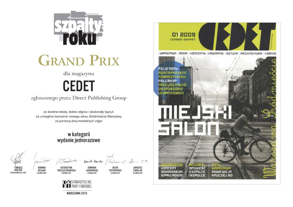
Yesterday my magazine Cedet received the Grand Prix at the annual Szpalty Roku awards organized by SPF. According to the head of the jury Tomasz Raczek, Cedet is a haute couture magazine. This is the second time one of my magazines receive this award at Szpalty Roku.

You can view the magazine here.

Thursday, 13 May 2010

Unused Logo

I made this logo for a fashion magazine called BB. Unfortunately the mag never saw daylight. I like its simpleness. Reminds me of the stuff I had to do at art school.

Wednesday, 28 April 2010

A Trendy Revamp

My first assignment in my new workplace was to revamp a 52-page mag called Trendy. The client, a shopping mall in Gdańsk called Galeria Bałtycka, asked for a new and more elegant look. So I basically changed everything leaving only the format and the logo.
For headlines I used two free fonts: Spinwerad (by Gluk) and Existence (by Yeah Noah). For leads I chose Existence and one commercial typeface: Geometric Slabserif 703. The body text is Dutch 809 – also commercial.

In the end the client was quite pleased with the result.

Friday, 23 April 2010

Wednesday, 7 April 2010

A Slight Flare Of Retro


"Wizjonerzy Wizerunku" can be translated as "Image Visionaries" which stands for a group of stylists that work in the fashion and media industry. They asked for something classy and modern with a slight retro flare so I designed this logo and monogram with vintage florals. I based it on a typeface called Philospher.

Sunday, 4 April 2010

Instant Zombie Soup


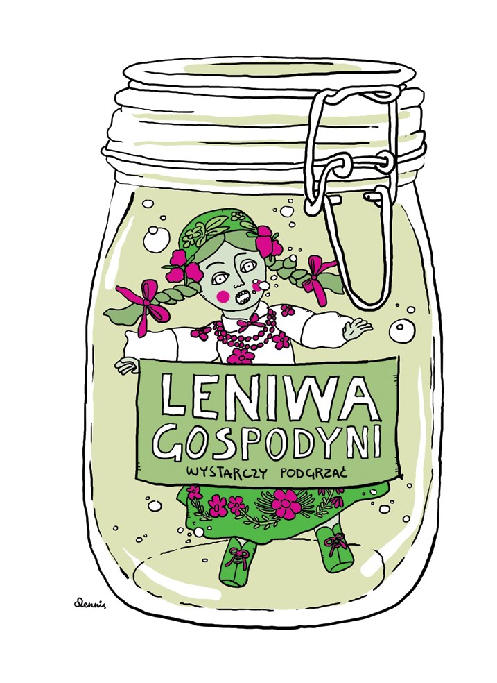
My debut as an illustrator in Media & Marketing Polska (#13, 2010). All in all 3 illustrations for a text about the instant food market in Poland. The art director wanted something funny so I came up with this creepy folk art doll, floating in a glass jar. I remember playing with dolls like these as a kid when visiting Poland in the 80s. You could get them in kiosks at the airport or ferry terminals and they all had this empty zombie expression.

Tuesday, 23 March 2010

Bass Player

My portrait of Jacek "Dżej Dżej" Jędrzejak who plays bass in Big Cyc. It was recently published in a magazine called Trendy.

Monday, 15 March 2010

Hum Hum

I like hummingbirds. This one will be printed on the cd of Baaba's new record.

Saturday, 13 March 2010

37

I was born exactly 37 years ago today. Because of this I have decided to make a comic novel – one frame each day during one year + one day. That makes 366 frames. The first episode will be published at 15:35, the exact time of my birth.

You can follow the comic here. And this is the Polish translation.

Friday, 5 March 2010

Dr. Mabuse Is Back!

I nearly fell of my chair when I saw my hand painted vinyl toy on display in this weeks issue of Przekrój magazine. It's nice this artform is gaining some interest in mainstream media.

My custom toy 1000 Eyes Of Dr. Mabuse is on sale at Vinylcanvas.

Monday, 1 March 2010

Disco Externo

Finally, the fruit of quite a few hours hard work – the cover of Baaba's new album Disco Externo. It all started, as it always does. Bartosz Weber – the brain behind Baaba – gave me a demo of his new record to get inspired and then come up with something adequate. Baaba's music is hard to put a finger on. It's innovative and surprising, experimental and a bit crazy.

Bartosz didn't have a title for the album so I came up with Disco Externo which is Portugese for external hard drive. One of my first drawings revolved around people with robot-like heads made from vintage tape recorders. This idea then grew into these surrealist bonsai tree mutants with hummingbirds circling around them. I think I had a dream about this...

Disco Externo will be released on the Lado ABC label on the 7th of April.

Saturday, 27 February 2010

Simple, Black, Heavy & Thick


This is the new logo for alternative band Baaba. Right now I'm working on the cover of their new album to be released in April. I didn't want to use the old logo. It didn't look good with the new artwork of the album. I needed something simple and black, something heavy and thick. It's actually based on a beautiful typeface called museo designed by Jos Buivenga, but I bet you couldn't tell.

Friday, 12 February 2010

Freaky Spin-Off

This drawing is a spin-off from a secret project I'm working on right now. Those vintage reel-to-reel tape recorders are so cool...

Pop Suicide


An unpublished illo for Przekrój magazine. Unfortunately the whole text – a piece about suicide – was dropped. I didn't want it to be too depressing, hence the happy colours. Cheer up!